Conditional Formatting
You can format dashboard item elements whose values meet a specified condition. This feature allows you to highlight specific elements using a predefined set of rules.
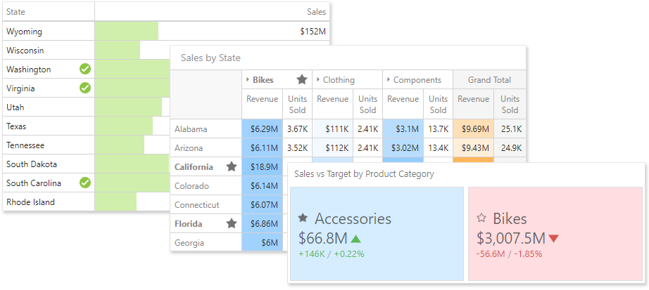
Format rules used in conditional formatting can be divided into groups depending on their purpose and can be applied to measure or dimension values.
Comparison rules used in conditional formatting can be divided into the following groups.
- Value - Allows you to compare static values (such as Greater Than, Less Than, Between, etc.).
- Top-Bottom - Highlights a specific number of topmost/bottommost values.
- Average - Highlights values above the average value or below the average value.
- A Date Occurring - Allows you to highlight date-time values that fall into a specified interval.
- Expression - Allows you to use complex conditions to apply formatting. You can also pass dashboard parameters to expressions.
- Icon and Colour Ranges - Allows you to apply formatting by displaying specific icons for different ranges of values. You can select a predefined set of icons or use a specific icon for each range.
- Colour Ranges - Allows you to apply formatting using specific colours for different ranges of values. You can select a predefined set of colours or use custom appearance settings to highlight values within specified ranges.
- Gradient Ranges - Allows you to apply formatting using gradient colour scales.
- Bar - Allows you to visualise numeric values using bars. You can also colour bars corresponding to positive and negative values using different colours.
- Bar Colour Ranges - Allows you to visualise numeric values using bars whose colours are contained in the specified colour set.
- Bar Gradient Ranges - Allows you to visualise numeric values using bars whose colours are contained in the specified colour gradient.
You can create comparison rules for measures or dimensions. The table below lists format conditions that can be applied to different types of data items.
- Measure/numeric Dimension
- Value
- Top-Bottom
- Average
- Expression
- Icon Ranges
- Colour Ranges
- Gradient Ranges
- Bar
- Bar Colour Ranges
- Bar Gradient Ranges
- string Dimension
- Value with the condition type set to Equal To, Not Equal To or Text that Contains
- Expression
- date-time Dimension
- Value
- A Date Occurring for dimensions with the continuous date-time group interval
- Expression
- Icon and Colour Ranges
- Colour Ranges
- Gradient Ranges
- Bar
- Bar Colour Ranges
- Bar Gradient Ranges
Create and Edit a Format Rule
To create a format rule, perform the following steps.
- Select the required measure/dimension by whose values a format condition will be calculated, open the Conditional Formatting section of the data item menu and click "+" to add a new format rule.
Specify the data item to which conditional formatting is applied using the Apply to combo box and select a condition type from the list.
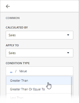
The format rule's menu is opened. This menu depends on the selected format condition and the type of the dashboard item. Here you can specify settings specific for the selected condition. For example, the Value format rule allows you to set a value that will be compared with dimension/measure values and specify a format rule style. The image below displays settings where values greater than 300M will be coloured in pale green.
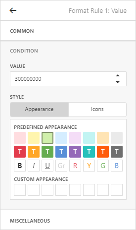
You can specify additional settings in the Miscellaneous section of the format rule's menu. This section contains settings depending on the type of the dashboard item. For example, you can manually specify an intersection level for the Pivot or apply the current rule to a row in the Grid.
- The format rule is now ready and will be applied to the dashboard item.
To edit a format rule, open the Conditional Formatting section of the data item menu, select the required format rule and click the Edit button (the  icon). To delete the selected format rule, click the Delete button (the
  icon).
You can see existing format rules for the entire dashboard item. To do this, open the dashboard item's Options menu and go to the Conditional Formatting section.
When creating a new format rule, you can select the required appearance settings in the Condition section of the format rule's menu. This settings applied according to the current format condition. All format conditions allow you to customise appearance settings in a similar manner.
For example, the Value format condition allows you to specify appearance settings in the following way...
- The Appearance tab allows you to choose the predefined background colour or font.
- The Icons tab allows you to add the predefined icon.
... while the different types of Range format rules allow you to customise predefined range colours and values.
Colouring
You can manage colouring for the following dashboard items.
- Chart
- Scatter Chart
- Pie
- Pie Map
- Range Filter
- Treemap
The dashboard provides two ways of colouring dashboard item elements.
Global colour scheme. This colour scheme provides consistent colours for identical values across the dashboard. The image below shows the dashboard containing Pie and Chart dashboard items. Pie segments and chart series points corresponding to Beverages, Condiments and Confections dimension values are coloured using identical colours from the default palette.
When a global colour scheme is used, the dashboard reserves automatically generated colours for certain values regardless of the filter state.
Local colour scheme. This colour scheme provides an independent set of colours for each dashboard item.
When a local colour scheme is used, the dashboard reassigns palette colours when the filter state is changed.
To select a type of colouring dashboard item elements, open the dashboard item menu, go to the Colour Scheme section and use the Colour Scheme Type option.
Dashboard items allow you to manage the colouring of individual dimensions or all dashboard item measures using predefined colouring modes.
The following colouring settings are available.
| Setting | Description |
|---|---|
| Auto | Dimension values/measures are coloured by default. To learn how specific dashboard items colour their elements by default, see the Colouring topic for the corresponding dashboard item. |
| On | Dimension values/measures are coloured by different hues. |
| Off | Dimension values/measures are coloured with the same colour. |
You can configure colouring in two ways.
- To specify the colouring mode for the specific measure/dimension, open the data item menu and go to Data Shaping section. Use the Colouring option to specify colouring mode of this data item.
- To see a list of all measures/dimensions for which you can specify colouring mode, open the dashboard item's Options menu and go to the Colouring section.
If you enabled colouring by different hues for several dimensions/measures, all combinations of dimension values/measures will be automatically coloured using different colours from the default palette.
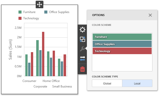
You can also customise colours of the specific palette using the Colour Scheme section of the dashboard item Options menu. To edit the colour scheme, click the Edit button (the  icon) of the corresponding colour.
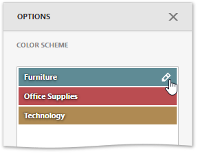
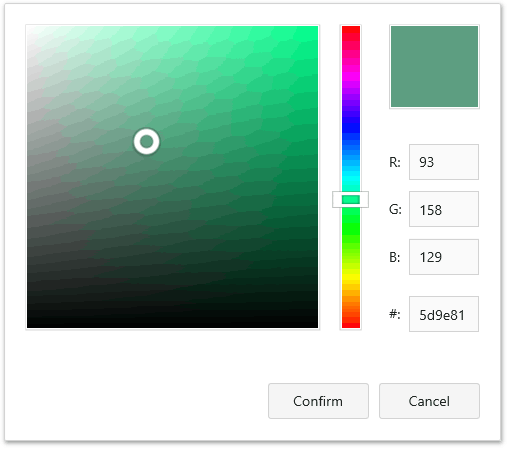
Then, pick any colour using the RGB colour model in the invoked colour picker and click Confirm to change the colour.
A new colour scheme will be applied to the dashboard item(s).
The Colour Scheme page of the dashboard menu allows you to customise colour tables by editing and adding colours.
Edit colours. You can reassign a colour in the selected colour table. For this, select one of the available schemes in the Colour Schemes pane and click the required colour in the Colours pane to provide access to the Colour combo box.
Clicking the Colour dropdown button invokes a colour picker where you can specify a new colour.
Click Confirm to change the automatically assigned colour for the selected value and update the current colour scheme.
Add colours. The Colour Scheme page allows you to add a new value with the specified colour to the selected colour scheme. To do this, use the Add colour button.
Specify the dimension value of the added colour or select the required measures. This creates a new value whose colour can be specified as described in the Edit colours section.
You can remove manually added values using the Remove button (the
 icon).