The Chart dashboard item supports different types of series - from simple bar and line charts to candle stick and bubble graphs.
By default, Chart visualises data using the Bar series. To switch between series types, click the required data item in the Values section and select the required series type in the invoked data item menu.
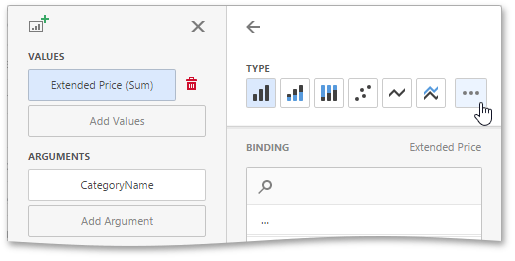
Click the ellipsis button to show all available series types.
To configure common series options, go to the data item’s Options section.
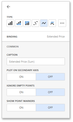
Here you can specify whether or not to plot the current series on the secondary axis, configure point markers behaviour, etc.
The following options are available.
| Option | Description |
|---|---|
| Caption | Specifies the series caption. |
| Plot on secondary axis | Specifies whether or not the secondary axis is used to plot the current series. |
| Ignore empty points | Specifies whether or not empty points are ignored when plotting the current series. |
| Show point markers | Specifies whether or not to show point markers for the current series. This option is in effect for the Line and Area series. Note that point markers are always shown when Master Filtering is enabled for the Chart dashboard item. |
The Point Label section of a value data item allows you to enable series point labels and manage their settings.
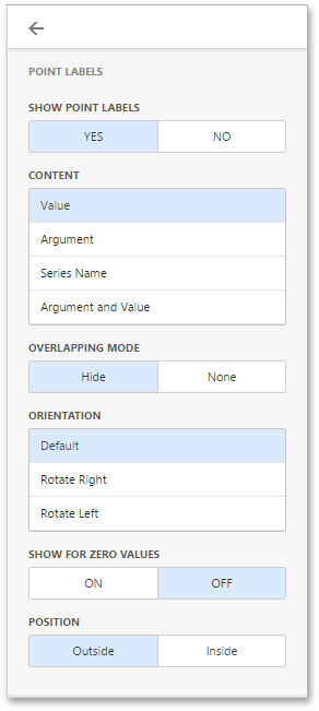
For example, you can specify whether or not to show point labels or set the label overlap mode.
The following options are available.
| Option | Description |
|---|---|
| Show Point Labels | Specifies whether or not to show point labels for the current series. |
| Content | Specifies the type of content displayed within point labels. You can select one of the following options: Value, Argument, Series Name or Argument and Value. |
| Overlapping Mode | Specifies the label overlap mode. You can reposition or hide overlapping labels or disable a resolving algorithm. |
| Orientation | Specifies the orientation of point labels. You can set default orientation or rotate point labels 90 degrees clockwise or counter clockwise. |
Bar series has additional settings.
| Option | Description |
|---|---|
| Show for zero values | Specifies whether or not to show labels for points with zero values. |
| Position | Specifies the position of point labels relative to bars. Point labels can be displayed inside or outside bars. |
Panes are visual areas within a diagram that display chart series. The Chart dashboard item can contain any number of panes.
Each pane has its own Y-axis and displays a specific set of series. All panes in a chart share the same X-axis.
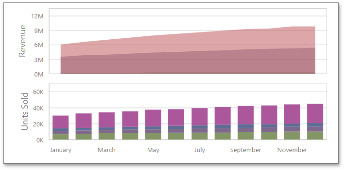
To add a pane, click the Add Pane button in the Chart's data item section.
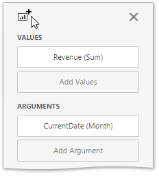
Once a new pane is added, the Web Dashboard creates another Values section. Use this section to provide data items that supply values to be displayed in the new pane.
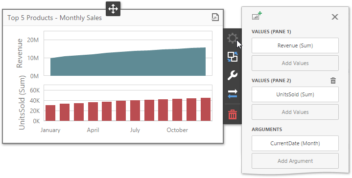
To remove a pane, click the Remove Pane button displayed in the added Values section.
A legend is an element of a chart that identifies chart series and series points.
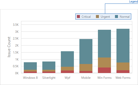
To customise legend options, go to the Chart's Options menu and open the Legend section.
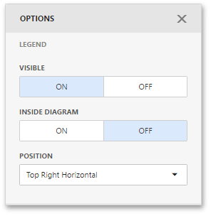
The following settings are available.
- The Visible option allows you to specify whether or not to show a legend.
- The Inside Diagram option allows you to locate a legend inside or outside the Chart.
- The Position option allows to set a legend's position and orientation.
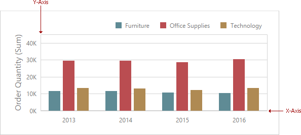
The Chart dashboard item displays two axes by default: the X-axis and the Y-axis. The X-axis is the axis of arguments and the Y-axis is the numerical axis of values.
Axis X
To access X-axis settings, go to the Chart's Options menu and open the Axis X section.
You can configure the following settings.
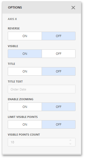
- The Reverse option allows you to reverse an X axis. If the X axis is reversed, its values are ordered from right to left.
- The Visible option specifies whether the axis is visible.
- The Title option specifies the X axis's title. Use the Title Text field to set the title.
- The Enable Zooming option allows you to enable zooming for the X axis.
- The Limit Visible Points option allows you to limit the number of visible points. The Visible Points Count field allows you to specify the maximum number of visible points.
Continuous and Discrete X-Axes
If the dimension in the Arguments section contains numeric data, the Chart can create either a continuous X-axis or a discrete X-axis.
If a continuous axis is used, the distance between argument values is proportional to their values. On a discrete axis, all argument values are an equal distance from each other.
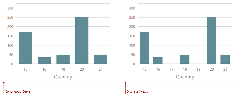
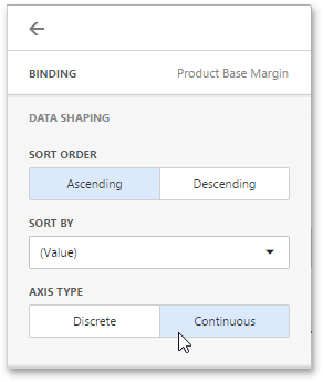
To specify the X-axis type in the Web Dashboard, go to the data item Data Shaping menu for the argument dimension and select the axis type. The image below illustrates how to change this setting for the Product Base Margin data item.
Axis Y
To access Y-axis settings, go to the Chart's Options menu and open the Axis Y section for a corresponding pane.
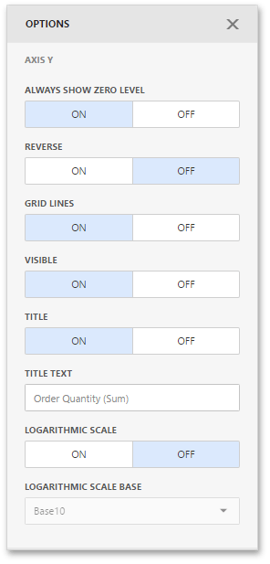
- The Always Show Zero Level option allows you to indicate whether or not an axis zero value should be displayed.
- The Reverse option allows you to reverse an Y-axis. If the Y-axis is reversed, its values are ordered from right to left.
- The Grid Lines options allows you to control the visibility of the reference lines used to improve the readability of a chart's visual data.
- The Visible option specifies whether the axis is visible.
- The Title option specifies the Y-axis's title. Use the Title Text field to set the title.
- The Logarithmic Scale option allows you to use a log scale to display Y-axis. Use the Logarithmic Scale Base field to set a log scale base.
Secondary Axis
The secondary Y-axis is useful when it is necessary to visually combine several charts into one. Secondary axes provide the ability to plot series with different ranges on the same chart.
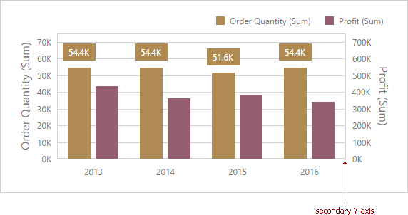
To plot the required series using the secondary axis, go to the data item Options menu for the value measure and turn the Plot on Secondary Axis option on.
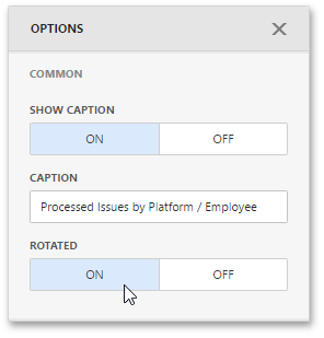
You can rotate the Chart so that the X-axis becomes vertical, and the Y-axis becomes horizontal.
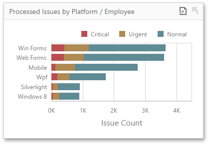
To rotate a Chart in the Web Dashboard, open the Chart's Options menu and go to Common section. Then, turn the Rotated option on.
