The Card dashboard item allows you to manage the position and visibility of elements displayed on cards. These elements include actual and target values, a delta indicator and corresponding delta values, a sparkline, etc.
To manage the position and visibility of card elements, choose a predefined layout template and customise its settings.
The table below contains information about the available layout templates:
| Layout Type | Example | Description |
|---|---|---|
| Stretched | 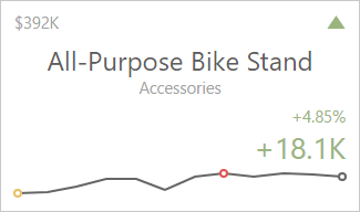 |
The Stretched layout template arranges card elements so that they occupy an entire card area. |
| Centred | 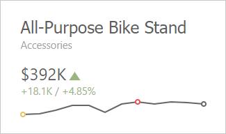 |
The Centred layout template is used to centre card elements so that they occupy a specified width/height. |
| Compact | 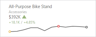 |
The Compact layout template is used to arrange card elements so that they occupy the minimum area. |
| Lightweight |  |
The Lightweight layout template displays the minimum set of elements within a card. |
For all layout types, you can change the visibility of its elements, or you can specify the display value type for data-bound elements. To learn more, see the Change Layout paragraph below.
The Card dashboard item uses the Stretched layout template that arranges card visual elements in the following way by default:

To learn more about the available value types and visual elements, see Change Layout.
Delta Indicator and delta values (such as Percent Variation or Absolute Variation) are colored depending on delta settings. To learn how to manage delta settings, see Delta.
To change a card's layout in the Web Dashboard's UI, invoke the Binding menu, click the required data item in the Cards section and go to Cards Layout in the data item's menu. Select the required layout type and click the Edit button (the  icon) to change its settings. The following settings are available:
- Min width - Specifies the minimum width of the card content.
- Max width - Allows you to specify the maximum width of the card content. Select the Auto option to determine the maximum width automatically or switch to Custom and specify the required width manually.
You can show/hide the following values and visual elements within the card:
| Value | Description | Example |
|---|---|---|
| Title | Displays values of the last (bottommost) dimension placed in the Series section. | Microsoft Office Keyboard |
| Subtitle | Displays combined values of all dimensions except the last (bottommost) dimension. | Technology - Computer Peripherals |
| Absolute Variation | An absolute difference between the actual and target value (see Delta). | +18.1K |
| Actual Value | A summary value for a measure placed in the Actual placeholder. | $392K |
| Card Name | A card name. | Revenue vs. Target |
| Percent of Target | A percent of a target value (see Delta). | 104.85 % |
| Percent Variation | A percent difference between the actual and target value (see Delta). | 4.85 % |
| Target Value | A summary value for a measure placed in the Target placeholder. | $374K |
| Dimension {Name} | Allows you to display values of a specific dimension placed in the Series section. | Technology |
| Element | Description | Example |
| Delta Indicator | Indicates whether the actual value is less or greater than the target value (see Delta). |  |
| Sparkline | Visualises the variation of actual or target values. To learn more, see Sparkline. |  |
Use the Apply to All Cards button to propagate the specified layout settings to all cards corresponding to Actual-Target pairs. The Reset button resets all setting to their default values.
Delta
Cards allow you to visualize the difference between the actual and target values using special delta values and a delta indicator. If the default layout is used (Stretched layout type), the card displays the following delta values/elements:
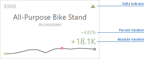
- Delta Indicator - Indicates whether the actual value is less or greater than the target value.
- Percent Variation and Absolute Variation - delta values that show a difference between the actual and target value. You can also display the Percent of Target value. To do this, customise the card's layout.
To customise settings that relate to the calculation and display of delta values/elements, invoke the Binding menu, click the required data item in the Cards section and go to Delta Options in the data item's menu.
Then, specify the following settings:
-
Result Indication - You can specify the condition for displaying delta indication.
-
Greater is Good - The 'good' indication is displayed if the actual value exceeds the target value; if the target value exceeds the actual value, the 'bad' indication displays.

-
Less is Good - The 'bad' indication displays if the actual value exceeds the target value; if the target value exceeds the actual value, the 'good' indication displays.

-
Warning if Greater - A warning displays only if the actual value exceeds the target value.

-
Warning if Less - A warning displays only if the target value exceeds the actual value.

-
No Indication - Indication does not display.

-
- Threshold type / Threshold value - For instance, you can specify that a specific indication should display when the actual value exceeds the target value by 10% or by $2K. Use the Threshold type combo box to select whether you wish to specify the comparison tolerance in percentage values or absolute values. Then use the Threshold value box to specify the comparison tolerance.
Sparkline
Sparklines can be used to visualise the variation of actual or target values (for instance, over time).
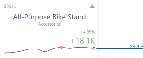
You need to provide a date-time or numeric dimension (in the Sparkline section) whose data is used as argument values to display a sparkline within the card.
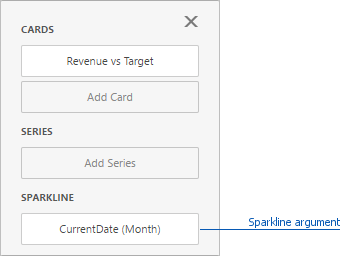
If you have provided both actual and target values, a sparkline visualises the actual value's variation.
To change sparkline settings in the Web Dashboard's UI, invoke the Binding menu, click the required data item in the Cards section and go to Sparkline Options in the data item's menu. The following options are available:
| Sparkline Options | Description |
|---|---|
| View type | Defines the sparkline’s view type. Sparkline data points can be represented as area, line, bars, or win and loss squares. |
| Highlight min/max points | Specifies whether to highlight the minimum/maximum points of a sparkline. |
| Highlight start/end points | Specifies whether to highlight the start/end points of a sparkline. |
The Card dashboard item allows you to specify the number of columns or rows in which cards are arranged. For example, the following image show cards arranged into 3 columns.
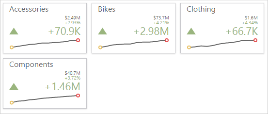
To control how cards are arranged, use the Layout section in the Card's Options menu.
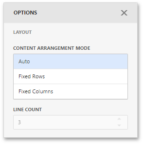
The following modes are available.
| Arrangement Mode | Description |
|---|---|
| Auto | Automatically resizes cards to fit within the dashboard item. |
| Fixed Rows | Allows you to arrange cards in a specific number of rows. |
| Fixed Columns | Allows you to specify the number of columns in which cards are arranged. |
To specify the number of rows / columns, use the Line Count field.